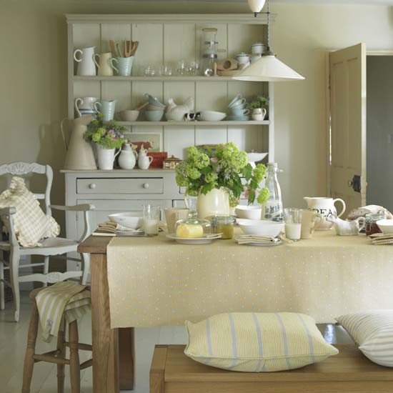
Since we're on the subject of kitchens... which kitchen most inspires you out of all these images and why?
I love getting a little peak into your personalities!
#1
#2
#3
#4
Unknown
#5
#6
#7
#8
#9
#10
#11
#12
#13
#14
#15
I'm leaning more towards #14.
I just love the whimsy and charm!


First time visit and wow: will be back! :)
ReplyDeleteToday is D-Day: I have to chose the colour for my kitchen and in a desperate attempt i googled and landed on this post: life-saver!
I love elements of most kitchens, but when I landed on number 12 it felt like home: an ideal home, albeit, but sigh...
My duck egg grey kitchen is being fitted next week. I found a colour by Crown (uk) called 'Limewash' that I hope will do the trick. It's hard making all these decisions on one's one and with such limited choice, but I cannot deny the satisfaction of knowing that for better or for worse once our little cottage is done it will be all because of all these little bizillion decisions made along the way,
Thank you! I feel you did this post just for me!
Valentina in faraway Cyprus
Love all your kitchen pics but for me pic 1 is the standout for these reasons....mostly white (including the floorboards), functional with the open shelves, over the bench lighting and big window. Spacious, modern, yet relaxed with the green garden(ish) chairs... Thanks for asking :-)))
ReplyDeleteI can only pick one? Because I see so many elements in a lot of kitchens that work for me. If I can only pick one it would have to be #9. It's spacious, bright and looks to have everything in it to really cook. It looks a little like my own kitchen minus the white cabnetry.
ReplyDeleteXX
Debra~
#14 by far...I love this kitchen island and those stools. Unique pieces that truly make a statement. If my kitchen was big enough I would certainly be on the search for one.
ReplyDeleteIt's number 10 for me... but they're all beautiful!
ReplyDeleteCindy
What fun! I pick no.10, because I love the painted lettering and the table, but I am keen on no.6 and no.12 because of the calm colours. Lovely diverse choices. Love Linda x
ReplyDeleteNumber 13 is really a charmer with all the jadite and Victorian wallpaper, but number 10 is a winner from my point of view, because the huge, low table, storage wall and concrete floor are disabled accessible without sacrificing style. If you put casters (wheels) on those huge storage baskets, you could get at all your pantry items easily without them having to be on view. Most of the dishes could also be reached from a wheelchair. Nobody is getting younger, so this is something to think about when you plan your kitchen.
ReplyDelete#1 and #7 just grab me and pull me in.... I can imagine some interesting discussions around that table in #1 and I cannot explain about #7 but it has a very simple feel to it....a bit undecorated.
ReplyDelete#3 for me. Just loved it. Claudia from Brazil
ReplyDeleteNumber 1! The tall Windows and light filled room with minimal furnishings left me a little breathless and missing my grandmama
ReplyDelete